Graves Golf Website Redesign (WIP)
This project delivered a website redesign for a golf instruction company that operates schools throughout the country teaching the Single Plane Swing, and operates a private golf training facility in Edmond, OK. The website redesign was to provide clarity in the user journey for new customer prospects.
The Problem to Solve
“Not the easiest site initially to get around but got to where I needed”
Design Solutions
“The rest of the Graves website is confusing and cumbersome; therefore I don't use it. I would give it one or two stars.”
The goal was to clean up the website structure and to create a clear path for new users to find the information they need to start their customer journey with Graves Golf. The aim is to improve new customer onboarding and decrease bounce rates.
This project led to:
1. Clearer communication of the Graves Golf business to new customers.
2. Easier navigation for new customers to find their next step in the sales process.
“Start Here” Page
Graves Golf has loyal customer base and a great inperson customer experience but lack clarity or clear user flows to help guide new customers in signing up for schools or becoming members on their website.
Customer Quotes:
“Page felt cluttered and couldn’t find the first steps for learning the single plane swing”
“The site is very hard to navigate. The text is too big and it takes too long to find what I'm looking for.”
Project Impact
The new navigation bar simplifies categories for selection.
Mega menu shows all related pages while highlighting two most important links.
Cleaned up the information architecture
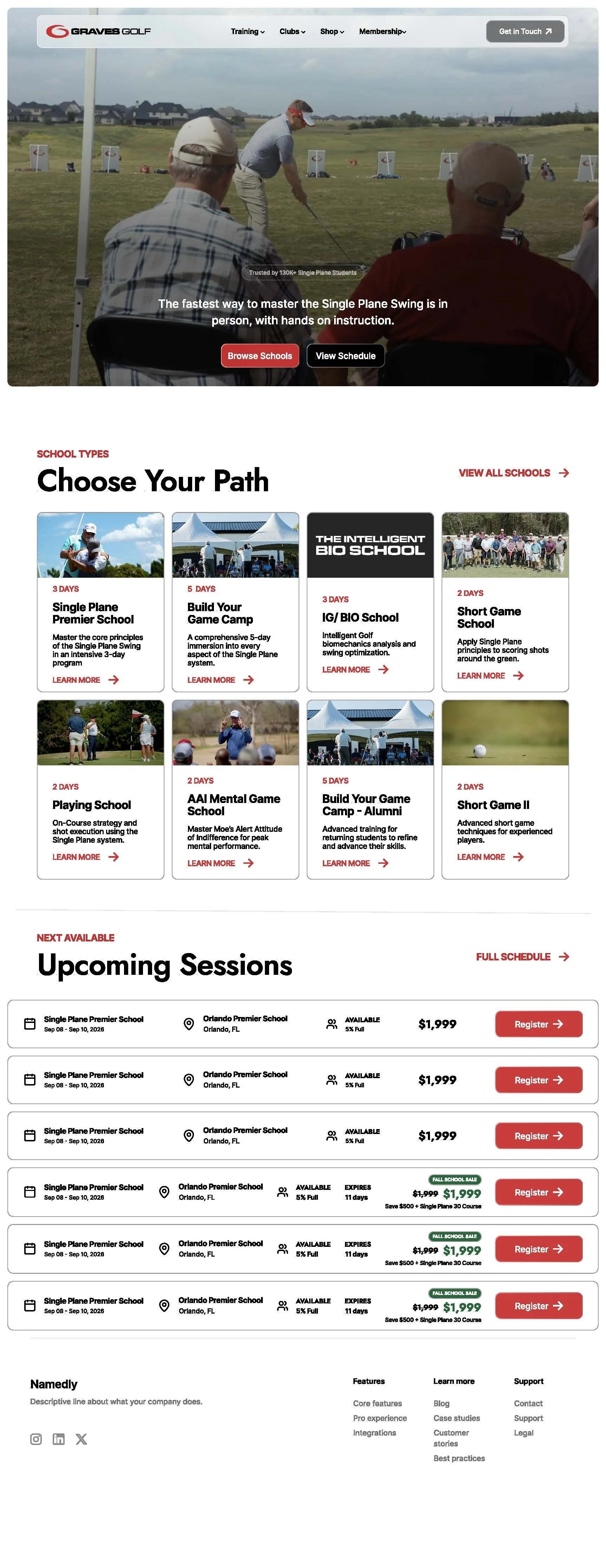
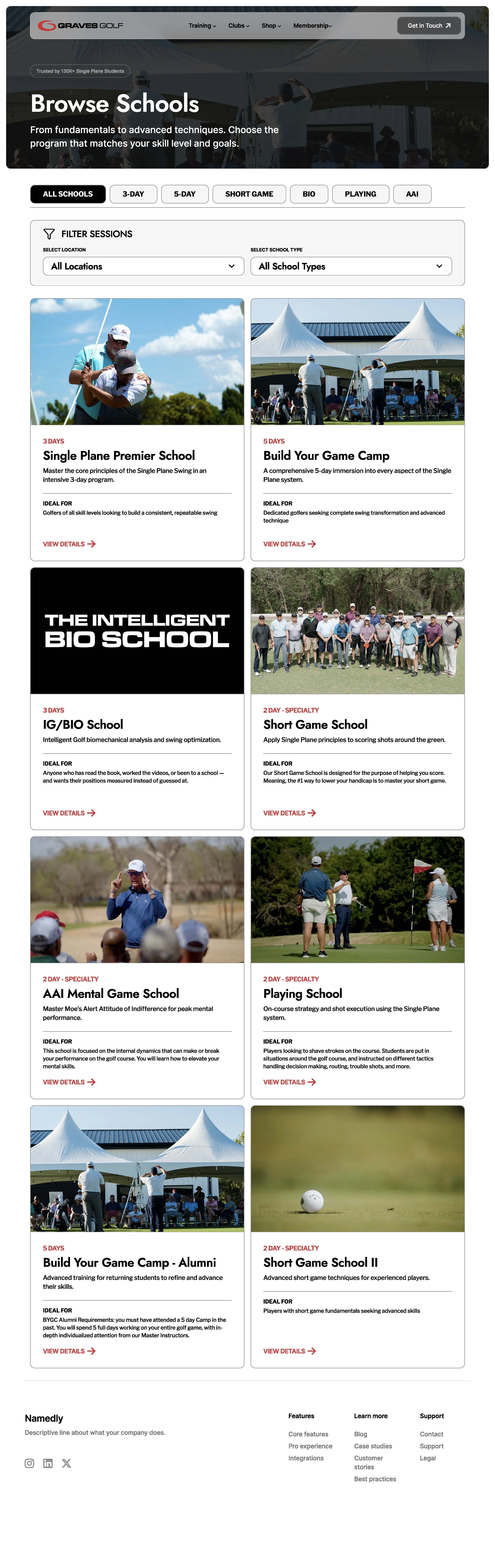
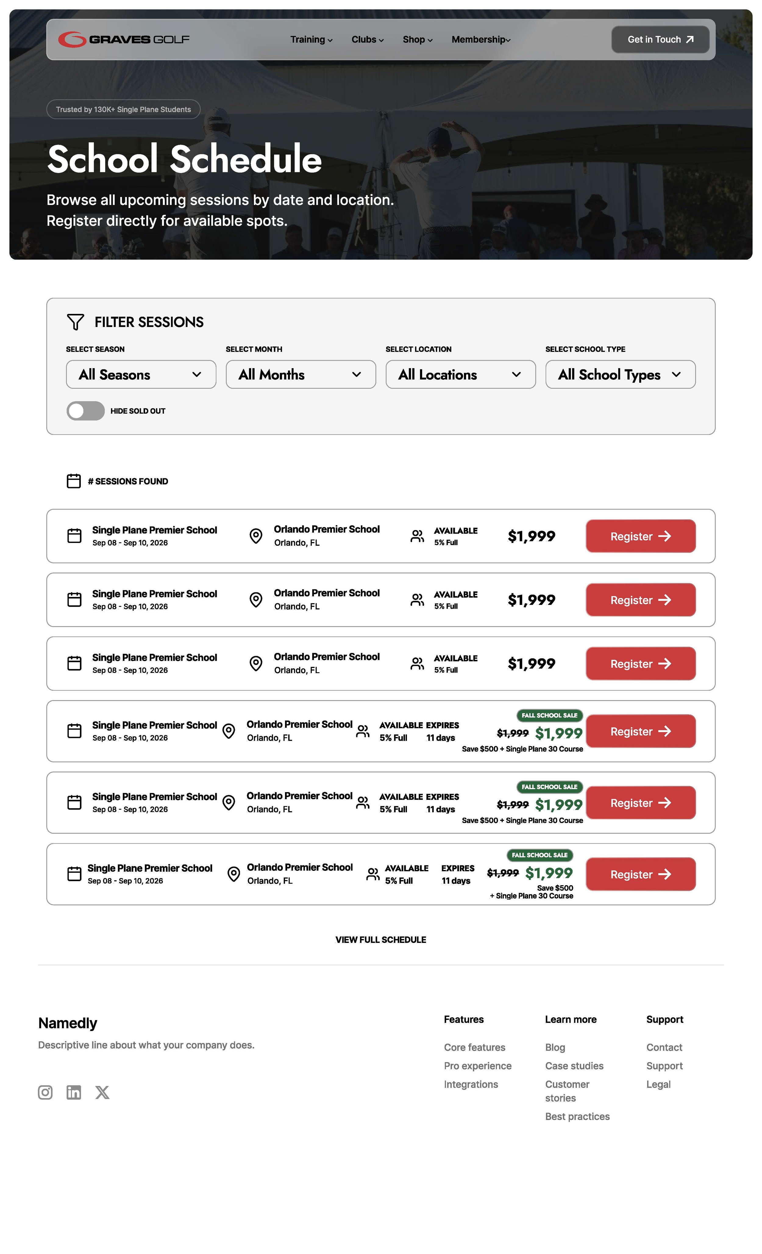
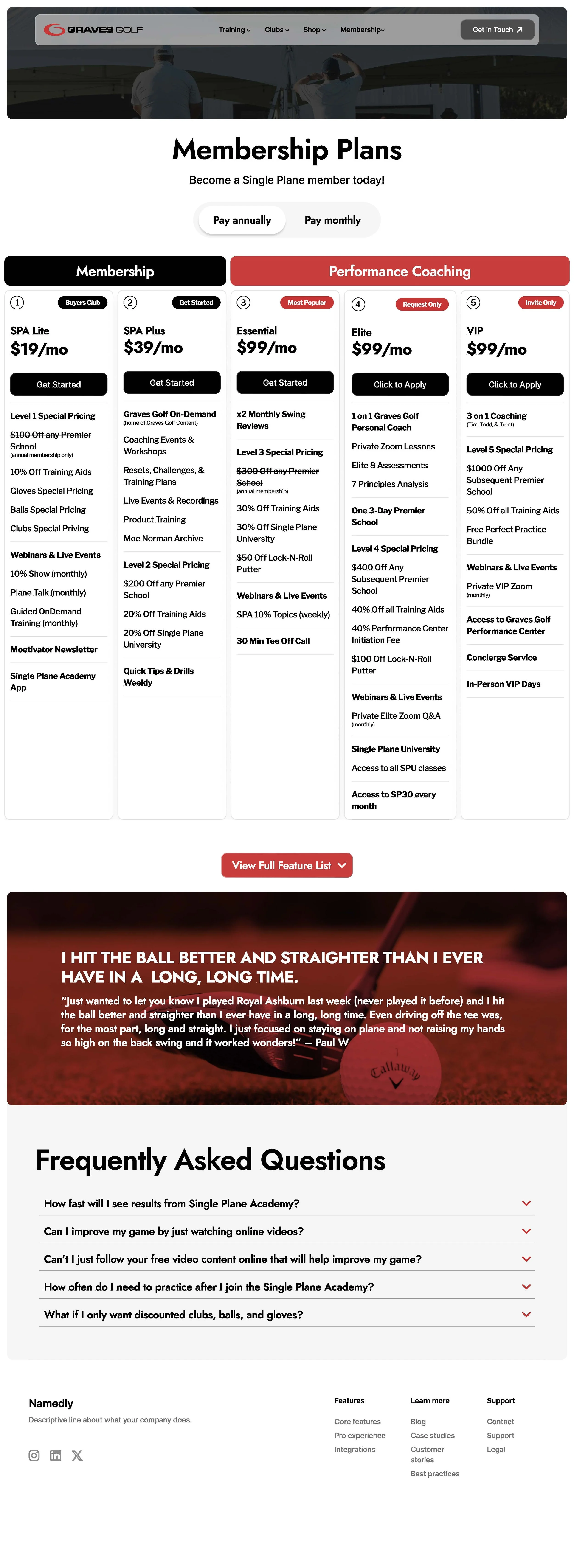
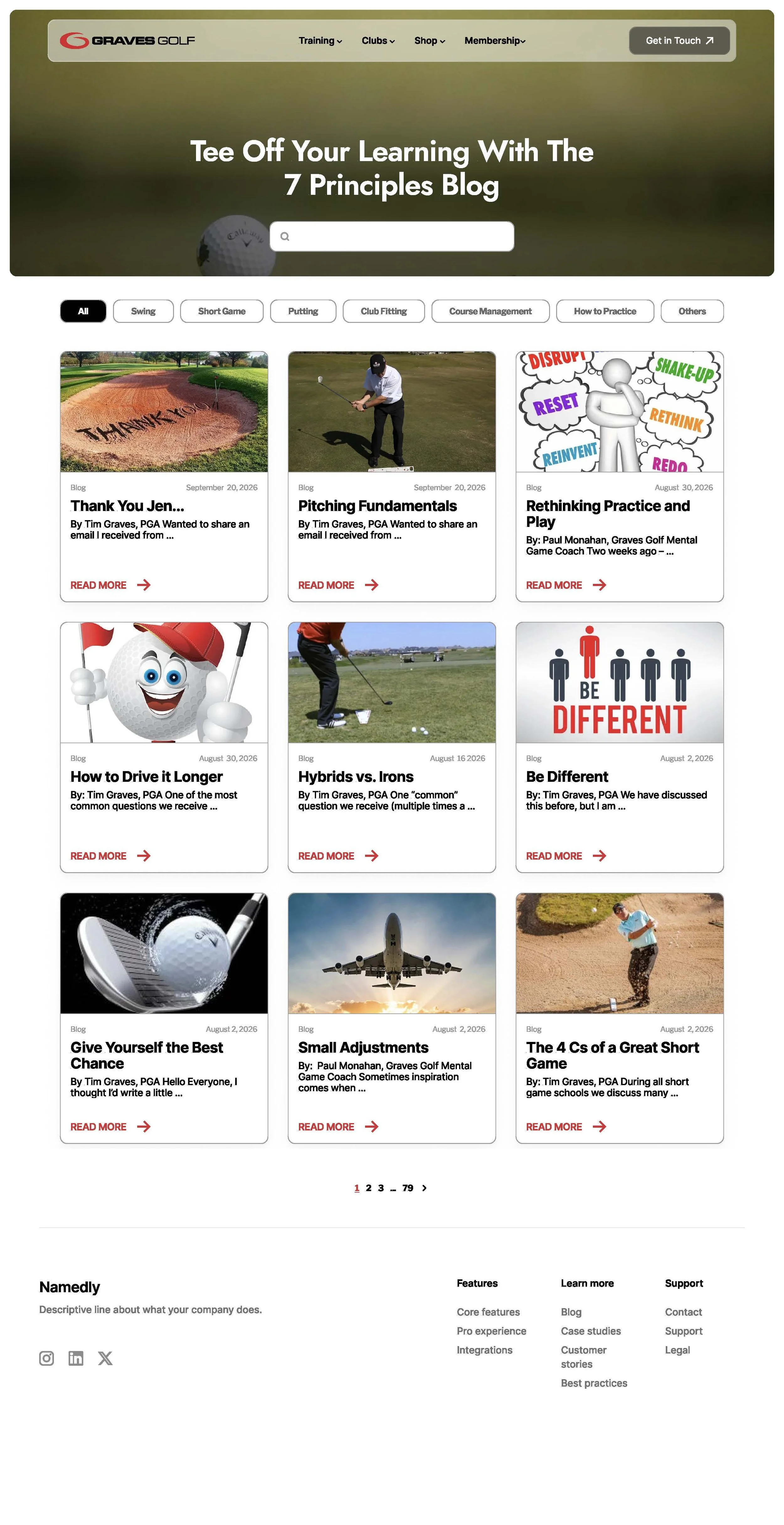
Pages
“Single Plane Swing” Page
Created a simple website design system.
Key Issues in the Current Experience
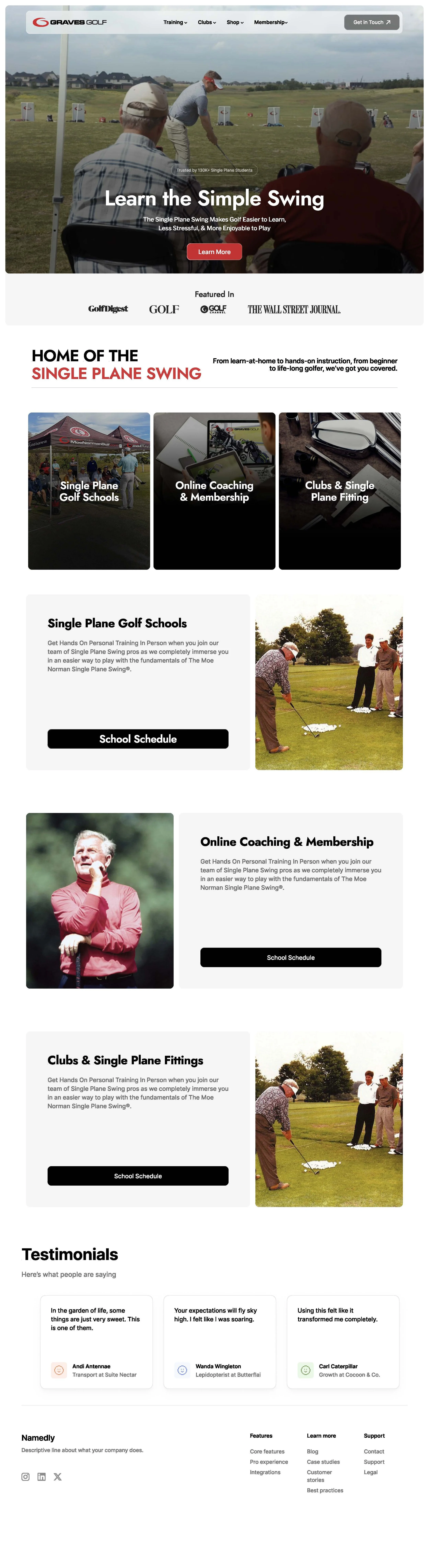
Home Page
Cluttered information made it hard for new customers to find what they were looking for.
No clear indication of what the next step should be for a new customer wanting to learn the Single Plane Swing.
Slow load times on pages made the site feel cumbersome.
Pages nested within pages create greater navigation confusion.
Confusion is created by having a Home page, a Start Here page, and a Single Plane Swing page.
Conclusion
This project is currently in the middle of usability testing to confirm design decisions or lead to improvements. Testing the best implementation path and using Claude code to streamline the development process.